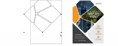
Designing a poster can be straightforward if you follow a clear, step-by-step process. Here’s a simple method to create an effective poster:
1. Define Your Purpose and Audience
Goal: What action do you want viewers to take (e.g., attend an event, learn a fact, or visit a website)? Audience: Who is the poster for? Tailor your design to their preferences (e.g., playful for kids, professional for adults).
2. Choose Size and Orientation
Common sizes: A3 (11.7x16.5 in), A4 (8.3x11.7 in), or custom dimensions. Orientation: Portrait (vertical) or Landscape (horizontal), depending on where it will be displayed (e.g., bulletin board vs. digital screen).
3. Organize the Layout
Use a grid: Divide the poster into sections (header, body, footer) to keep elements aligned. Hierarchy: Make the most crucial info (e.g., event name) the most prominent. White space: Avoid clutter by leaving empty areas around text and images.
4. Select Colors and Fonts
Color palette: Use 2–3 complementary colors. High contrast (e.g., dark text on light background) improves readability. Fonts: Choose 1 to 2 easy-to-read fonts. Use bold for headings and simpler fonts for body text. Example: A bold sans-serif (like Arial Black) for titles and a clean serif (like Georgia) for details.
5. Craft Your Content
Headline: Short, catchy, and clear (e.g., "Summer Music Festival 2024!"). Body text: Keep it concise. Use bullet points or short sentences. Essential details: Include date, time, location, contact info, or website. Call to action: "Register now!" or "Scan the QR Code."
6. Add Visuals
Images: Use high-quality photos or illustrations that match your theme. Icons: Simple icons (e.g., for dates) can communicate quickly. Avoid overcrowding: Use 1–2 key visuals to avoid overwhelming viewers.
7. Review and Refine
Check alignment: Ensure text and images are balanced. Proofread: Fix typos and formatting errors. Test readability: Step back and see if the poster is legible from 3–6 feet away. Get feedback: Ask others for input before finalizing.
8. Export and Share
Save as PDF (for printing) or JPEG/PNG (for digital use). Print: Use high-resolution settings (300 DPI) for physical posters.
Quick Tips for Success
Keep it simple: Less is more. Focus on one key message. Use templates: Tools like Canva, Adobe Express, or PowerPoint offer free poster templates.Test print: Check colors and readability on paper before mass printing.
What is the basic of poster design:
The basics of poster design revolve around clarity, visual appeal, and effective communication. Here’s a concise breakdown of key principles and elements:
1. Hierarchy & Focus
Primary Message: Highlight the most important information (e.g., event name, date, or call to action) using size, color, or placement.
Visual Flow: Guide the viewer’s eye through the poster (e.g., title → image → details → contact info).
2. Layout & Composition
Grids/Alignment: Use grids to organize elements neatly (e.g., columns or thirds).
Balance: Distribute visual weight evenly (symmetrical or asymmetrical).
Whitespace: Avoid clutter; give elements room to breathe.
3. Color Theory
Contrast: Ensure text/background contrast for readability.
Mood: Choose colors that evoke the right emotion (e.g., bright for energy, muted for elegance).
Consistency: Limit the palette to 2–4 colors. for cohesion.
4. Typography
Legibility: Prioritize clear fonts for body text (avoid overly decorative styles).
Font Pairing: Combine 1–2 typefaces (e.g., bold headline + simple sans-serif for details).
Hierarchy: Use size, weight, and spacing to differentiate headings, subheadings, and body text.
5. Visual Elements
Images/Graphics: Use high-resolution, relevant visuals. Icons or illustrations can simplify complex ideas.
Branding: Include logos or brand colors if applicable.
6. Purpose & Audience
Goal: Define the poster’s purpose (inform, persuade, promote).
Target Audience: Tailor design to resonate with viewers (e.g., playful for kids, minimalist for professionals).
7. Call to Action (CTA)
Include essential details (e.g., time, location, website, QR code).
Make the CTA stand out (e.g., bold text or a contrasting button).
8. Practical Considerations
Readability: Test if the text is legible from a distance (e.g., 3–5 feet for small posters, farther for larger ones).
Printing: Use CMYK color mode, 300 DPI resolution, and bleed margins if printing physically.
Tools to Use:
Design software (Canva, Adobe Photoshop/Illustrator, Figma).
Templates for quick, structured layouts.
By balancing these elements, a poster becomes both visually engaging and effective in conveying its message.


